booksie.com rewrite · design phase · 2026-10-31 · private link, not indexed
Three redesign directions for booksie.com
Three independent designers (AI agents, each unaware of the others) each produced a complete design system and 32 high-fidelity page mockups, from the public homepage to the chapter reader, the member dashboard and the writing editor, using real content from the live site. Below: what each one is, where they agree, and my recommendation.
A: Editorial
A literary magazine. Warm paper and ink, one vermilion accent, Newsreader serif for titles and reading, Source Sans for the interface. Cover art leads every listing; writing without a cover gets a generated one. Light, dark and sepia themes.
Keeps the current wordmark's coloured "k", now vermilion italic.
Current vs newPagesDocs
B: Product
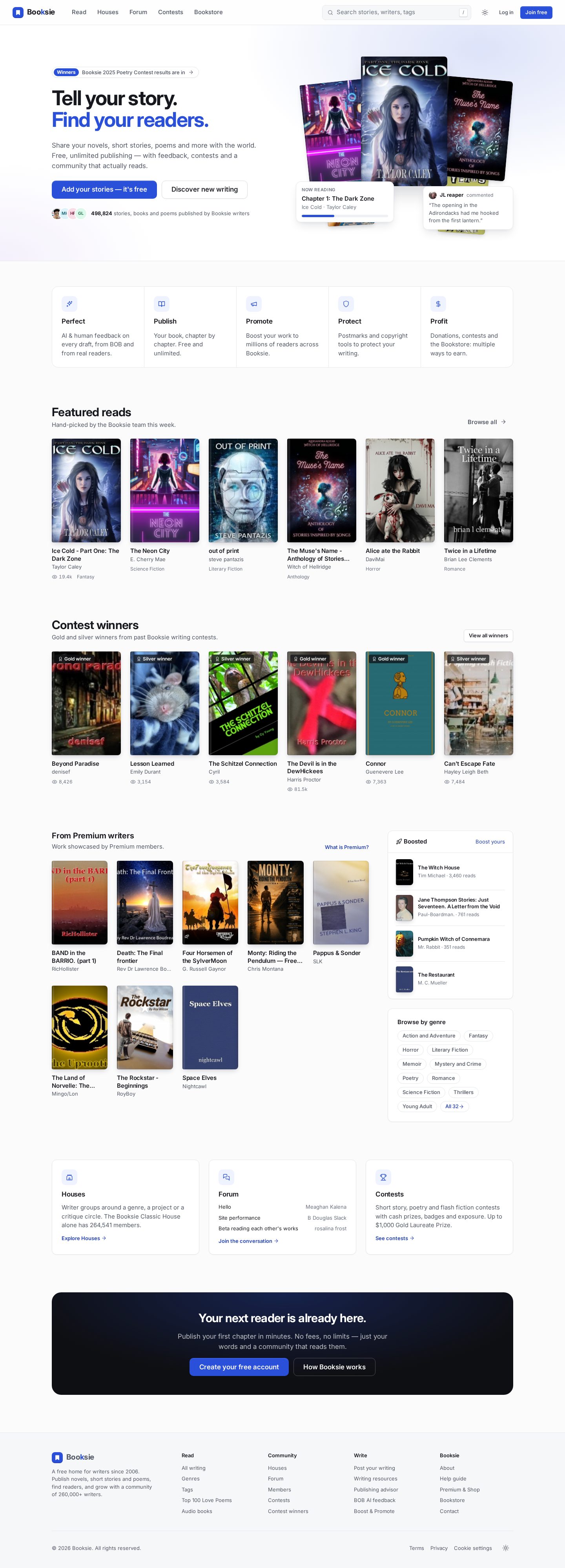
A clean, app-like platform. Neutral greys with one accent, a deeper version of today's Booksie blue; Inter for the interface, Source Serif for reading and writing. Light and dark themes, a professional writing editor, members get a side nav on desktop and a tab bar on mobile.
Keeps the "k" and adds a bookmark mark.
Current vs newPagesDocs
C: Community
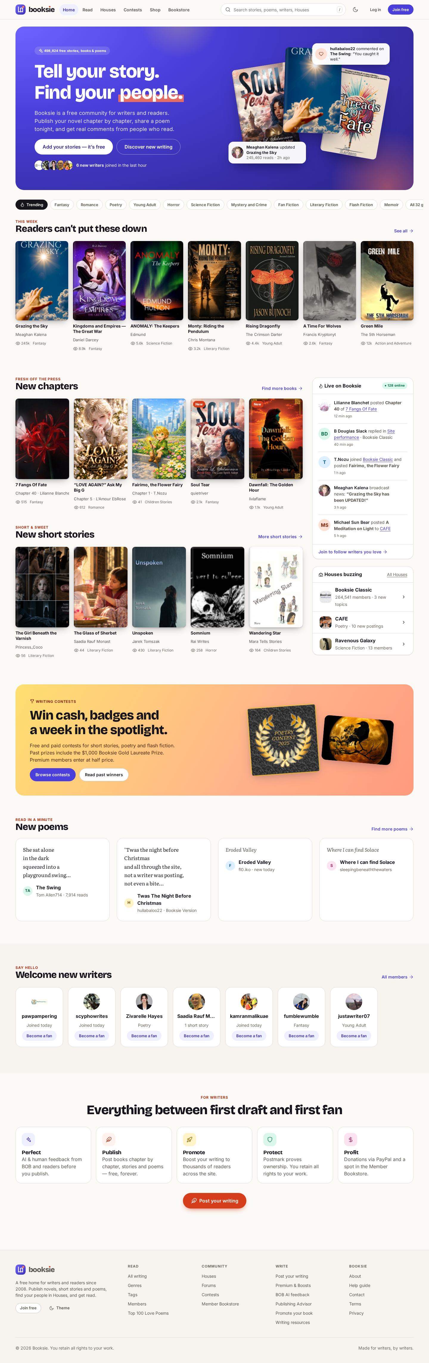
A vibrant, mobile-first social reading platform. Warm background, indigo for actions, coral for "write"; Bricolage Grotesque headings, Inter interface, Literata for the text. Discovery-driven homepage with live activity, Houses and new writers. Dark theme plus sepia and night reading modes.
New lower-case wordmark with a coral dot and an app icon.
Current vs newPagesDocs
Side by side
| A: Editorial | B: Product | C: Community |
|---|
| Feel | Distinctive, premium, "a place for serious writers" | Calm, trustworthy, familiar; closest to today's brand | Energetic, social, young; the biggest change |
|---|
| Chapter reader | The most book-like page; inline comments in the margin; sepia mode | The cleanest; its own slim top bar; paragraph comments in a side panel | Calm text, quick reactions at the end of a chapter, mobile bottom bar |
|---|
| Member area and editor | Step-by-step editor wizard with autosave | Strongest dashboards and a real writing tool (outline, word counts, AI feedback panel) | Two-pane messages with a "Requests" folder against spam; portfolio as cards |
|---|
| Implementation effort | Medium: custom typography, generated covers | Lowest: standard components, maps directly to Blade + Filament | Highest: activity feeds, live blocks, more motion |
|---|
| Risk | May feel too "serious" for the teen-to-adult audience | Can look generic unless executed with care | Larger brand break; needs more content to feel alive on quiet days |
|---|
What all three proposed independently
These came from three separate agents without seeing each other's work, so they are strong signals about the current site and should be adopted whichever direction is chosen:
- Forum moves to the top navigation; "Shop" disappears as a top-level item (the merch page is empty) and folds into Premium.
- A persistent "Write" button, and a mobile tab bar with Write in the middle.
- One Notifications/Alerts page instead of the eight scattered counters (comments, replies, fans, quickees, shelves, bookstore reviews, news, AI reviews).
- A real three-step sign-up (account, profile, membership) instead of the current detour through the membership page.
- A generated title-on-colour cover for writing that has no cover image, instead of the grey placeholder.
- Dark and sepia reading modes; inline comments kept, but as a margin or panel, not as highlights that break the text.
- Boosted content always labelled and shown at most once per page.
My opinion
A is the most beautiful and the most distinctive of the three; it would make Booksie look like nothing else in its category, and it treats the writing as the hero. Its risk is tone: Booksie's community skews young and informal, and paper-and-serif can read as "literary journal" rather than "my place to post tonight".
B is the safest and the most buildable. It keeps the brand people recognise (the blue, the "k"), it maps one-to-one onto Blade components and Filament, and its reader and editor are the most practical of the three. Its risk is blandness: it only works if the typography and spacing are executed as carefully as in the mockups.
C has the best homepage for discovery and the warmest community feel, and the best mobile thinking. But it changes the identity the most, and its liveliness depends on activity feeds that, on the real data (about 1,900 active members a month, most activity in one House), could look empty outside peak hours.
Recommendation
Take B as the base system (tokens, components, layouts, editor, dashboards), and borrow two things from A, the reading typography and the generated covers, and three from C, the mobile tab bar, the "Requests" folder in messages, and the House activity block on the homepage. Adopt the seven shared proposals above as is.
If mixing feels risky, choose pure B: a single consistent system is easier to execute well than a blend. The chosen direction becomes the UI specification of the new Laravel application; its handoff.md describes the Blade layouts, components, interactive islands, image sizes and performance budget.
How to review
- Open each direction's Current vs new page: every live page is shown next to its redesign at 1440 px and 390 px.
- Open a few Pages directly (they are real HTML, responsive; resize the window or open on a phone). Cover images load from www.booksie.com.
- Some numbers in the mockups are illustrative (notifications, message threads, boost prices, some read counts); each README lists exactly which.
Produced 2026-10-31 by three independent agents on Claude Opus 5.5; summary and recommendation by the coordinating session (Claude Fable 5.1). Working files: tasks/rewrite/design/ on the arm64 server.